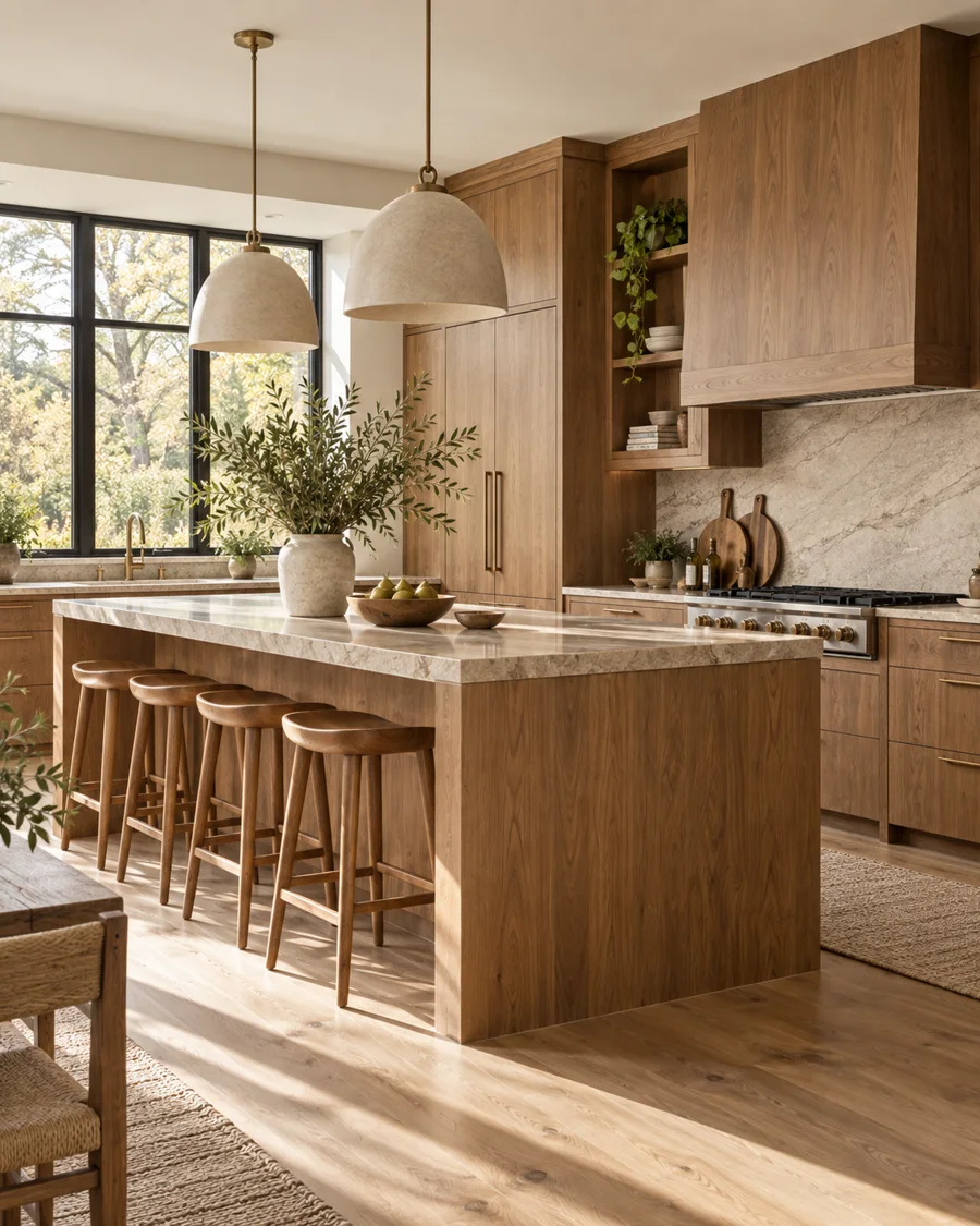
Choose the Character of the Grain First
Oak, walnut, ash and other woods differ not only in color but in how strongly their grain reads across a cabinet elevation. Rift- or quarter-sawn oak can appear more linear and controlled, while broader cathedral grain creates more movement. Walnut tends to bring richer contrast and a more furniture-like quality. In a kitchen with many cabinet doors, that grain pattern becomes one of the largest visual elements in the room, so it deserves the same attention as a paint color or stone slab.
Decide Whether the Wood Is the Background or the Feature
A kitchen with timber on every cabinet can feel calm when the grain is consistent and surrounding surfaces are quiet. Alternatively, wood can be concentrated on an island, tall pantry wall or breakfast area while painted cabinetry carries the rest of the room. This second approach is useful when you want warmth without allowing grain to dominate a compact space. Neither is inherently better; the decision should follow how much visual movement the room can comfortably support.
Pair Wood With Stone by Temperature
Wood and stone are natural partners, but their undertones need to cooperate. Warm oak can sit beautifully with creamy limestone or warm-veined quartz; walnut can handle cooler greys and deeper stones because its color has more weight. Very yellow timber beside a pink or cool blue-grey stone may make both materials look less intentional. The safest way to choose is to view actual samples together in the room rather than selecting each material from separate photographs.
Use Veneer Intelligently
High-quality veneer is not a compromise by definition. It can provide consistent grain, allow large flat panels to remain stable and make premium species more practical across extensive cabinetry. Solid timber is valuable for edges, frames, furniture and places where thickness is visible, but using it for every large door is not always technically desirable. What matters is the quality of the substrate, edge treatment, grain matching and finish. A poorly printed wood-look laminate is a different proposition from a well-composed natural veneer.
Control the Number of Wood Tones
A kitchen may include timber cabinetry, a wood floor, dining furniture and stools, and they do not all need to match. In fact, exact matching can make the room feel overly coordinated. The more useful strategy is to establish one dominant tone and keep the others either clearly lighter, darker or quieter. Problems arise when several medium warm woods sit close together but not quite alike. Deliberate contrast looks layered; near-matching often looks accidental.
Protect High-Wear Areas Without Hiding the Material
Kitchens expose wood to water, grease, heat and repeated cleaning, so finish selection matters as much as species. Cabinet manufacturers use different lacquers, oils and sealers, each with its own repairability and maintenance requirements. Around sinks, dishwashers and floor-level edges, construction details that prevent standing moisture are important. The goal is not to make wood indestructible but to choose a finish whose aging you can accept and maintain.
Let Lighting Bring the Grain to Life
Wood changes dramatically under different light temperatures. Warm lighting can enrich oak and walnut, while very cool light may flatten warmer species or make pale ash look grey. Direction also matters: light grazing across a veneered wall emphasizes grain and creates depth, while uniform frontal light reduces contrast. In a wood-heavy kitchen, lighting should reveal the material without exaggerating orange or red undertones.

